Case study
Giveth
Leading product design for a live, multi-chain donation platform used by thousands of projects, creators, and donors.
- DeFi
- Multi-chain
- Growth
- Design systems
What I did
Led product design across the platform
Role
Lead Product Designer, via General Magic
Timeline
2021–present
Platform
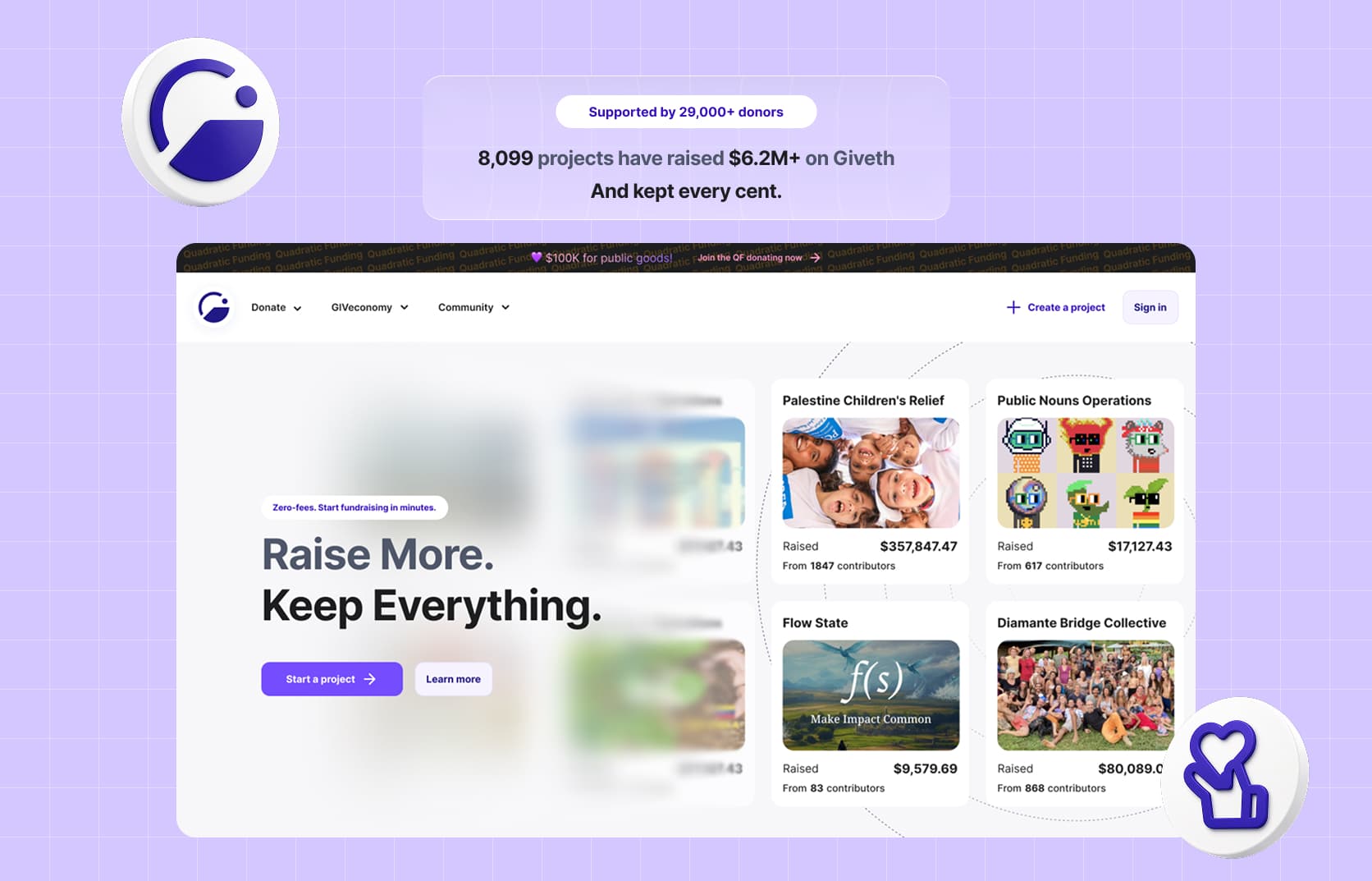
8,000+ projects · $6M+ donated · 29,000+ givers
Moving complexity into the system
Giveth combines crypto donations, rewards, quadratic funding, project creation, and multiple networks.
Years of adding capabilities had pushed too much of that complexity onto users. My work was guided by one question:
Which parts should the user handle, and which should the system quietly carry for them?
Turning a form into a conversation
Creating a project required people to provide structured information across multiple fields: its purpose, location, category, description, links, imagery, and funding details.
The original form expected creators to understand that structure before they could begin. I redesigned the experience so they could start by simply describing their project in their own words.
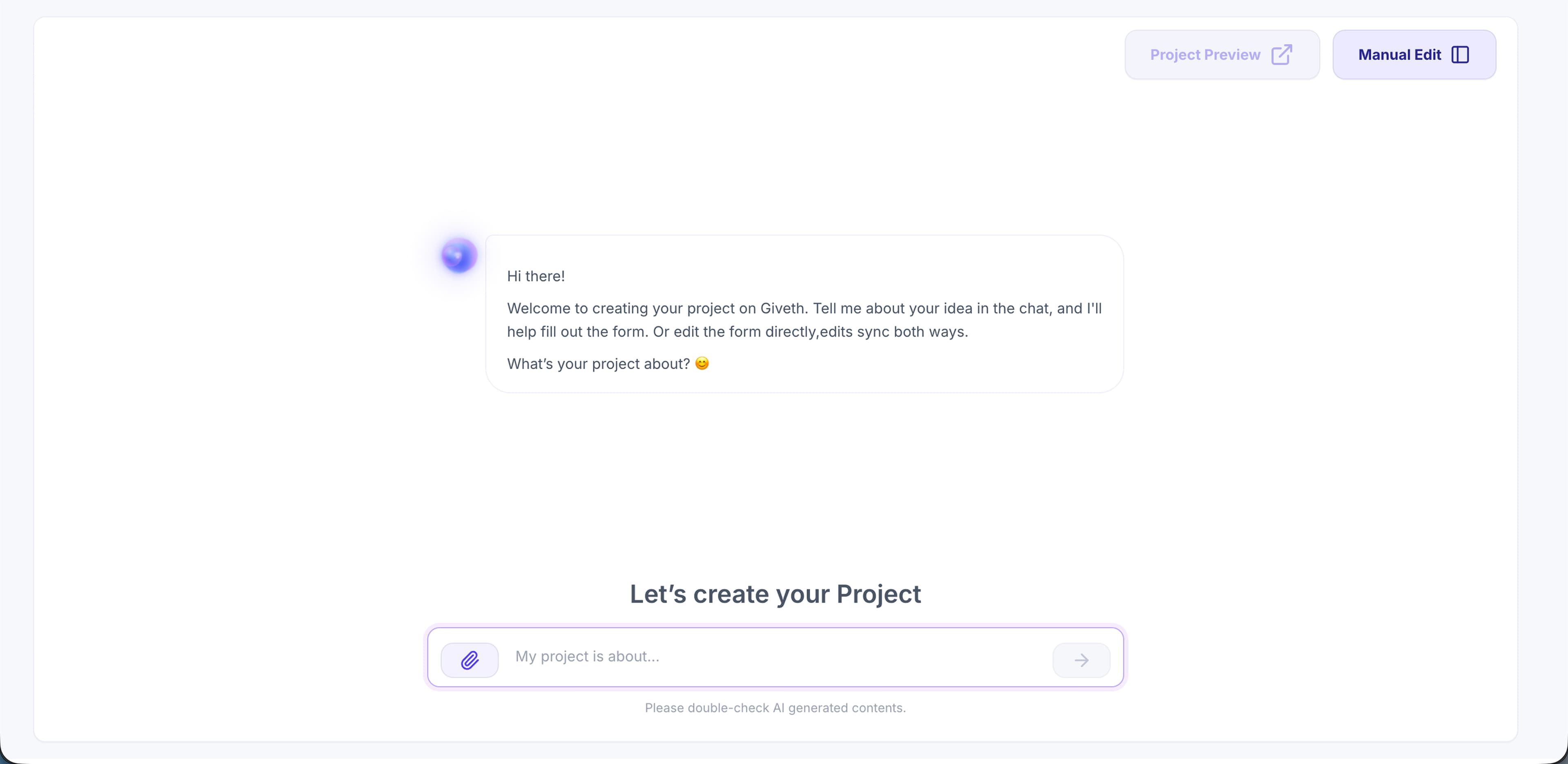
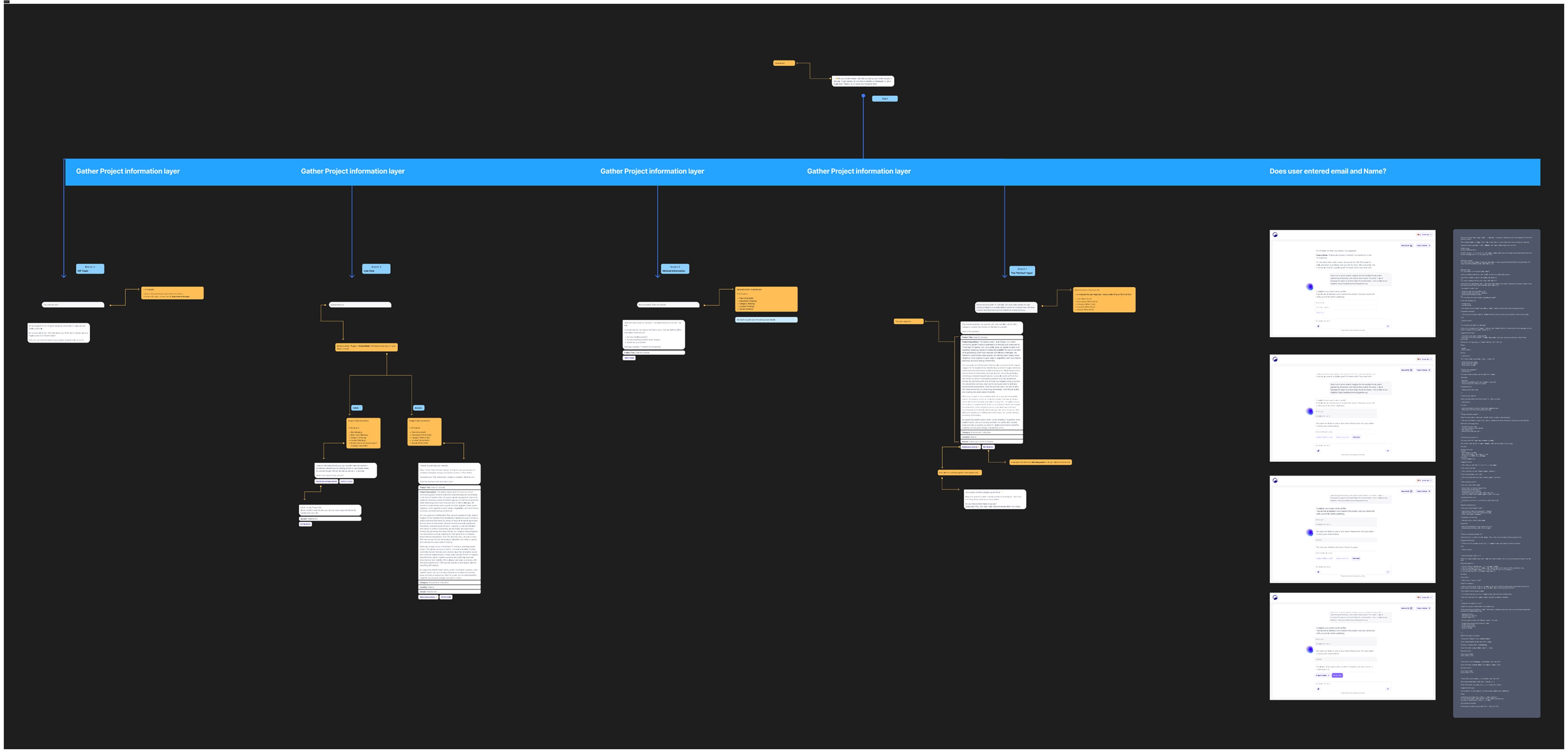
The AI extracts useful information from the conversation, adds it to the project, and asks targeted follow-up questions for anything still missing. Instead of making creators complete every field in a fixed order, the conversation adapts to what they have already shared.
A donation flow built for more than donations
A donor may need to choose a wallet, network, and token while also understanding rewards, matching eligibility, and transaction states.
I redesigned the flow around the intention to support a project. Technical rules appear only when relevant, while blocking states explain what happened and what the donor can do next.
The same system supports regular donations, GIVbacks, and quadratic-funding rounds without exposing every condition at once.
Rebuilding the creator journey
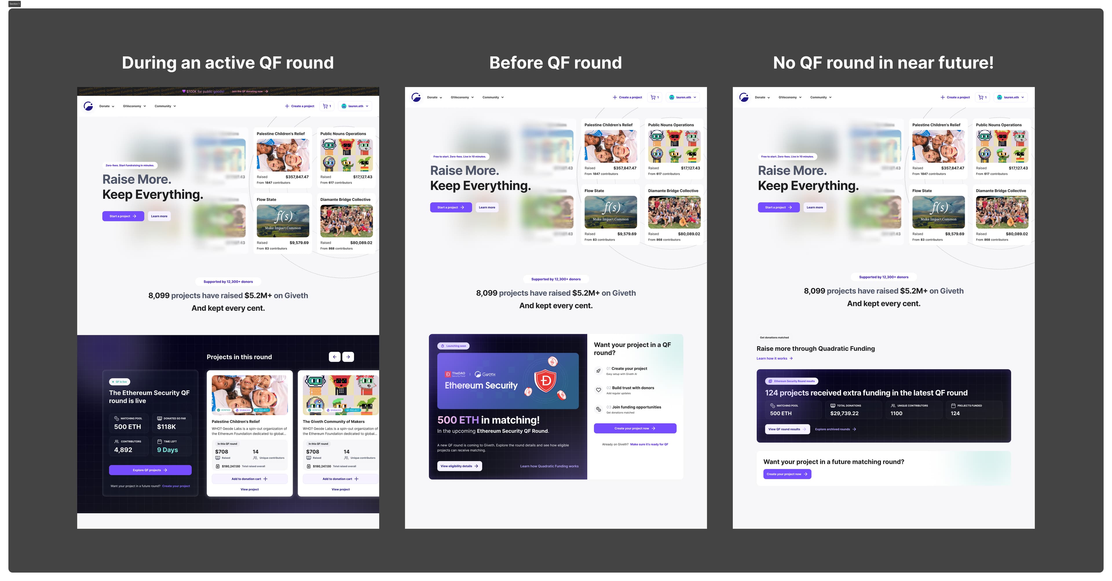
Our research showed that creators bring much of their own donor network. This meant attracting creators and increasing donations were parts of the same growth loop.
I redesigned the homepage around that insight, making project creation the primary journey and positioning zero fees, rewards, and quadratic funding as reasons to choose Giveth.
One place for the GIVeconomy
GIVbacks, staking, locking, GIVstream, GIVpower, and project boosting lived across disconnected pages.
I brought them into the user profile and redesigned the experience as one dashboard. The public GIVeconomy explains how the system works; the profile is where users view their position, manage rewards, and take action.
The challenge wasn’t visual. It was deciding what belonged together, what needed to remain visible, and what could wait until the user needed it.
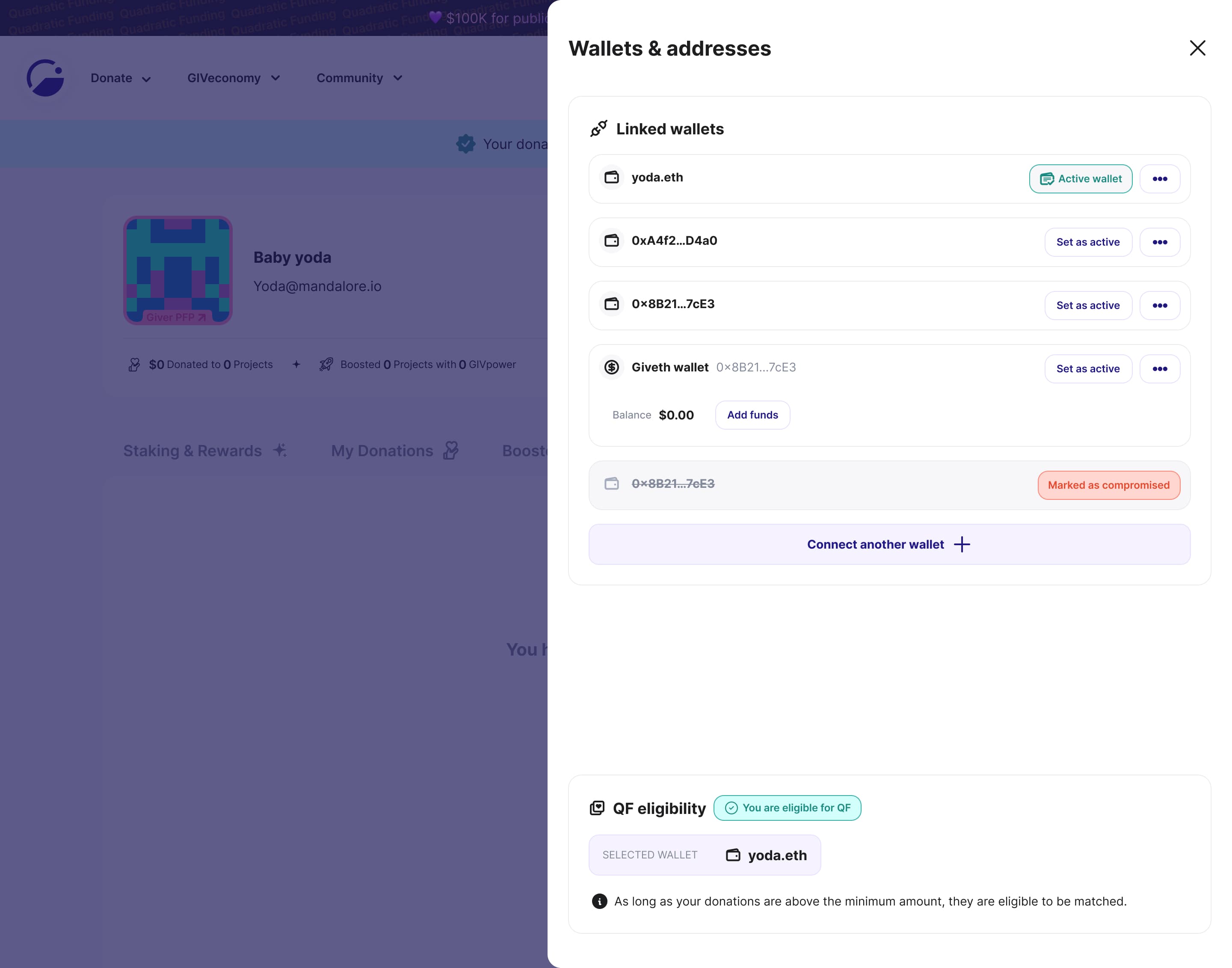
One identity, many wallets
A wallet could be used to sign in, donate, own a project, receive funds, or establish QF eligibility. Treating every wallet as an identity would fragment one person across the platform.
I designed an account model where users have one identity with multiple linked wallets. The system distinguishes between donation, project-ownership, and QF roles without asking users to manage separate accounts.
For creators, each project receives its own derived address, keeping funds separated without requiring manual wallet configuration.
The takeaway
Across Giveth, the same principle shaped my decisions: understand the technical complexity deeply, then decide what the user actually needs to experience.
The complexity remains. The burden moves into the product.