Case study
Droplet
Redesigning a social scheduling app so groups could plan recurring events without the usual back-and-forth.
- Mobile
- 0→1 redesign
- Design systems
What I did
Product strategy, UX/UI, prototyping, and design system
Role
Sole Product Designer
Timeline
July 2020–July 2021
Product
Mobile scheduling for fitness communities and social groups
From a working MVP to a coherent product
Droplet helped communities organize recurring activities, but its early MVP felt like another tool users had to learn.
Event creation was complicated, availability was difficult to understand, and planning still happened across a mixture of chats, calendars, and spreadsheets.
I joined after the MVP launch to redesign the core experience around how groups were already coordinating.
Bringing scheduling into the conversation
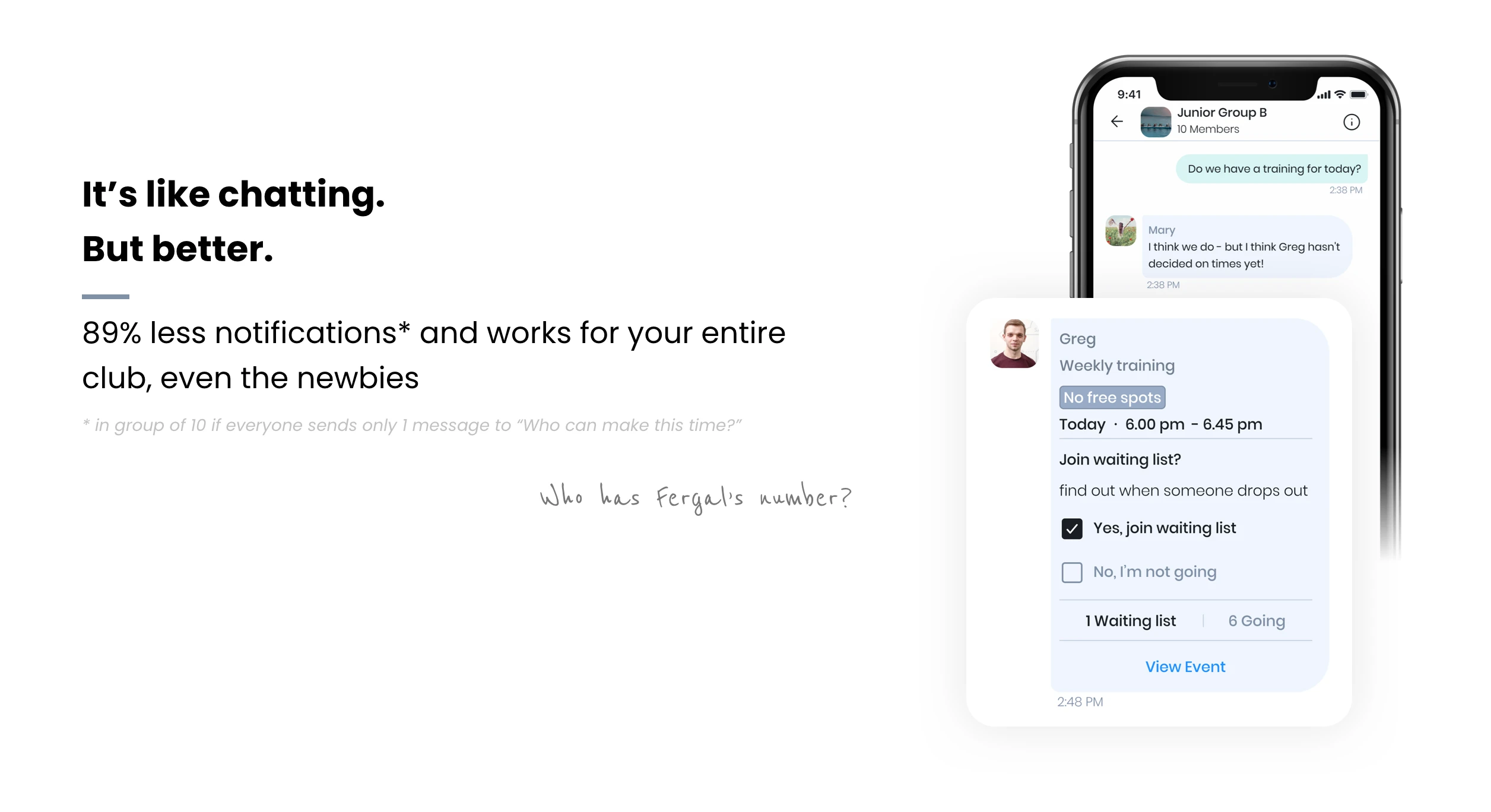
Most planning already happened inside group chats. Instead of asking people to leave that behaviour behind, we made scheduling part of it.
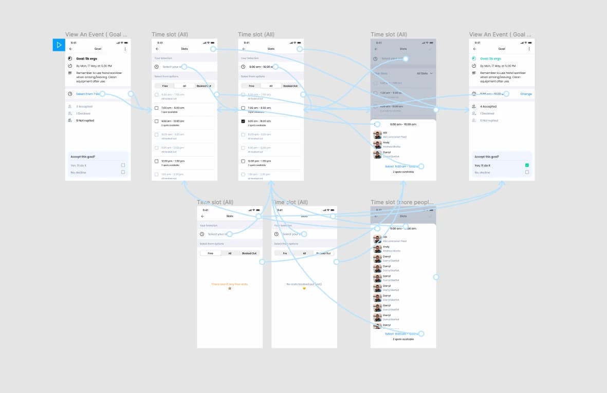
I designed an experience where organizers could create and share events inside conversations, members could respond with their availability in a tap, and the group could move from discussion to a confirmed plan without switching between tools.
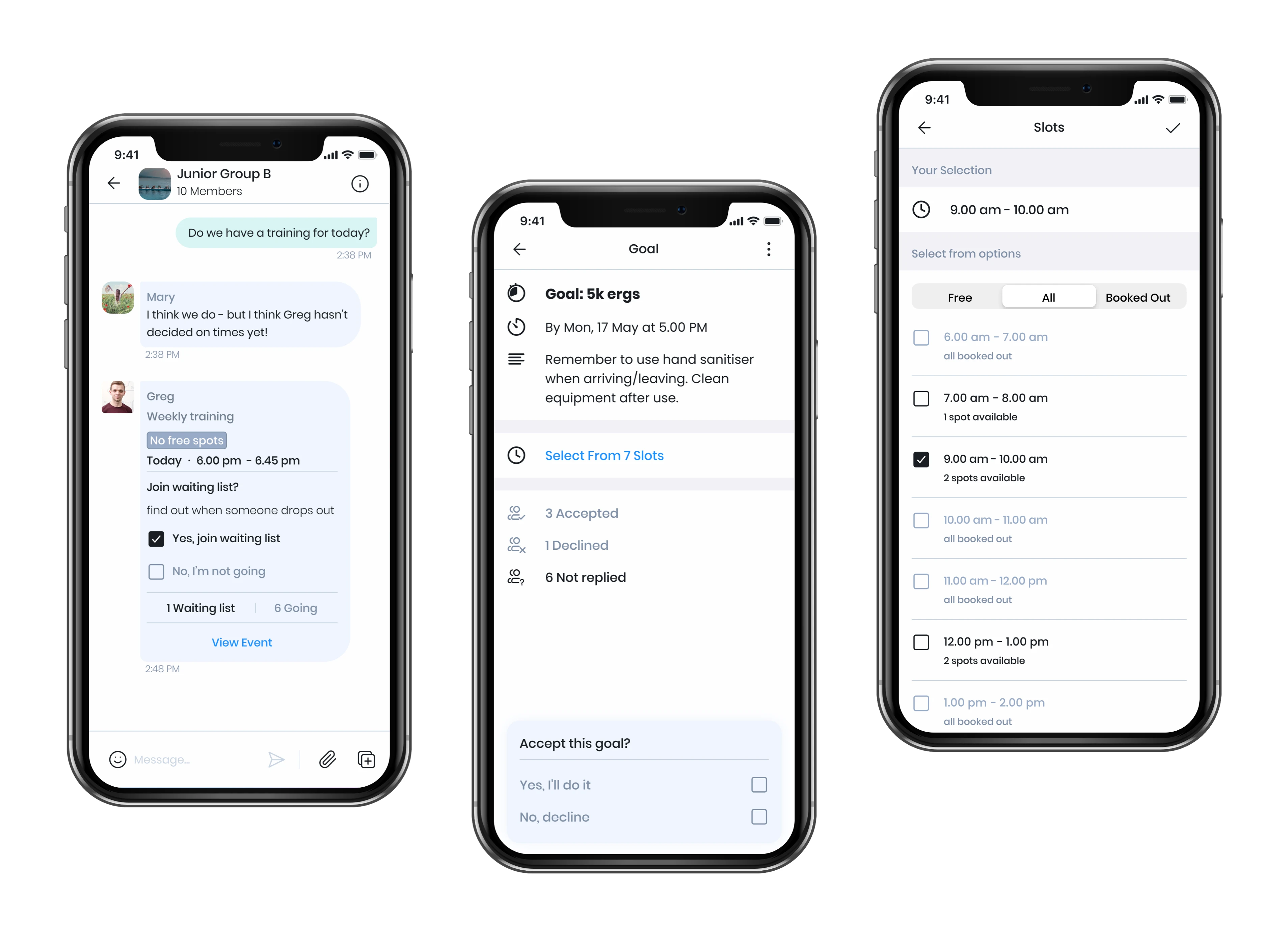
This became the product’s central idea: Droplet shouldn’t replace the conversation, it should help the conversation reach a decision.
Designing for people, not power users
Our guiding principle was simple:
If someone unfamiliar with the product needed an explanation, the design wasn’t ready.
I simplified labels, reduced the number of decisions in key flows, and designed clear mobile interactions for people with different levels of technical confidence.
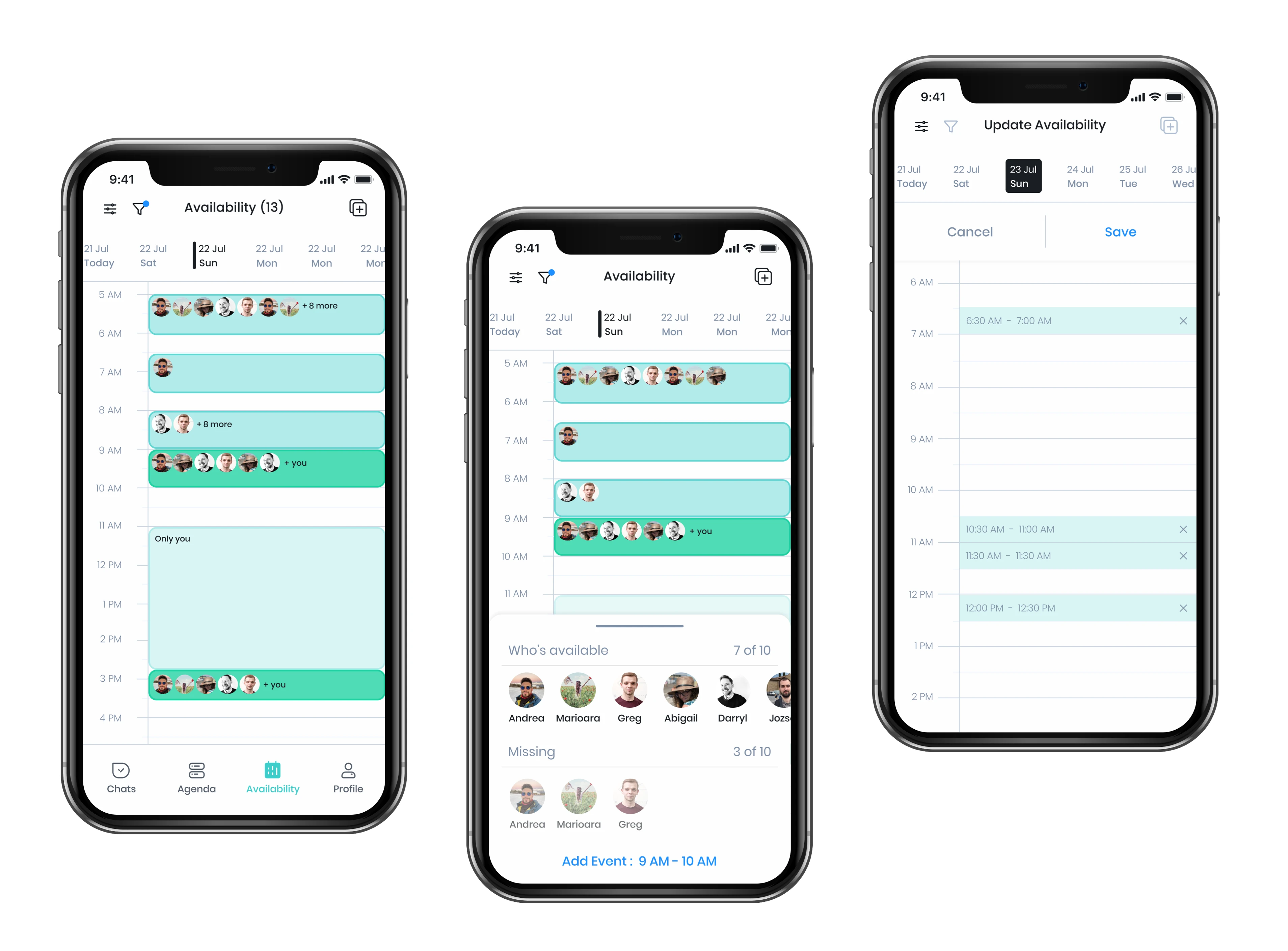
The calendar was also rebuilt around availability rather than dates alone. Members could show when they were free, giving organizers a shared view of the group before choosing a time.
Creating a system the team could build on
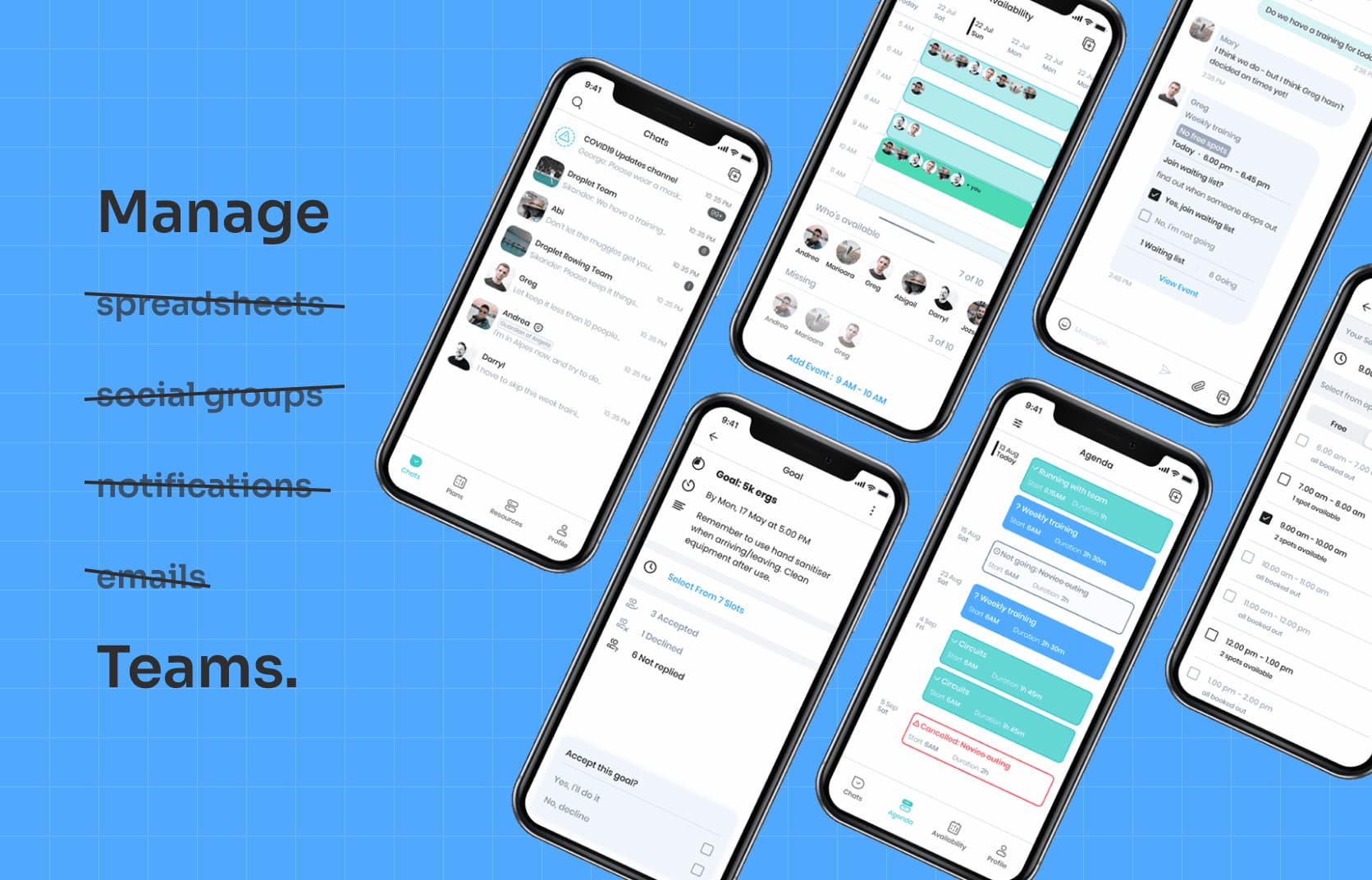
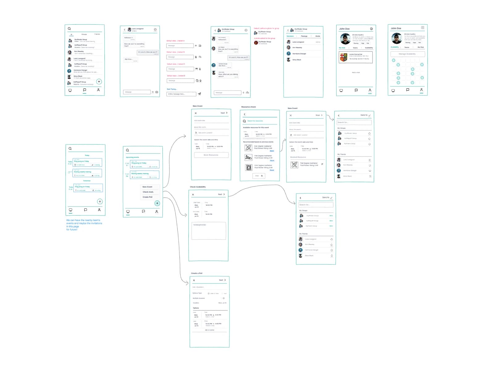
The MVP had grown without a consistent visual or interaction system. I introduced reusable components, shared patterns, and flexible mobile layouts across the product.
This gave Droplet a more coherent experience while creating a clearer foundation for designers and developers to extend.
The outcome
Droplet evolved from a collection of scheduling features into a clearer coordination experience built around existing group behaviour.
The work covered the full product, from understanding early-user feedback and restructuring key journeys to prototyping, interface design, and supporting implementation.
The result was a product that asked people to do less planning work, not learn another planning tool.